
Last modified: 2025-12-13 by ian macdonald
Keywords: punjab |
Links: FOTW homepage |
search |
disclaimer and copyright |
write us |
mirrors
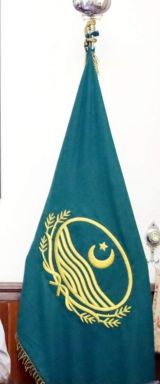
![[Dir]](../images/p/pk-punj2.gif) image
by Daniel Rentería, 19 October 2025
image
by Daniel Rentería, 19 October 2025
based on photo
The newer flag of Punjab is the same format as the previous one. It is unknown when the change happened. It is green with the provincial emblem placed over it in gold; it should be noted this emblem is strictly composed of golden details. In place of the provincial name in the central oval, the waves are shifted downward and the star and crescent are made larger.
Flag photo at https://governorhouse.punjab.gov.pk/system/files/gov_sshk_0.jpg
Daniel Rentería, 19 October 2025
![[Punjab]](../images/p/pk-punj3.gif) image
by Mello Luchtenberg, 8 November 2025 from
https://www.vexilla-mundi.com/pakistan_divisions.html and on
photo
image
by Mello Luchtenberg, 8 November 2025 from
https://www.vexilla-mundi.com/pakistan_divisions.html and on
photo
A variant of the flag is seen at https://www.dawn.com/news/1685612. This variant depicts the normal provincial emblem in gold, over a green field; noting the fact it includes the provincial name in Urdu.
Daniel Rentería, 8 November 2025
![[Dir]](../images/p/pk-punj.gif) by Arfan Hashmi, 23 May 2005
by Arfan Hashmi, 23 May 2005
The emblem of Punjab is reflective of the natural resources of the province - the wheat, and the 5 rivers which run through the province and from where the province derives its name (from Punj = Five, Aab = Waters).
Arfan Hashmi, 23 May 2005
![[Dir]](../images/p/pk-punj).gif) image
located by Daniel Rentería, 19 October 2025
image
located by Daniel Rentería, 19 October 2025
Source:
https://seeklogo.com/vector-logo/230804/government-of-punjab
Based
on some bad quality images of the Punjab Gazette, it appears the logo has been
used since its creation in 1970. Sadly, I am unable to find any legislation on
its use. As was noted in 2005, the emblem relates to its name. At the bottom,
three stalks of wheat on each side surround the main oval, tied together by a
ribbon. The central oval is heavily outlined, and reads at its bottom
"Government of Punjab" in Urdu. Just above are five water streams; and above is
the national star and crescent for its adherence to the faith and nation. The
logo can be in gold or green.
Daniel Rentería, 19 October 2025