
Last modified: 2018-12-15 by rob raeside
Keywords: strijen |
Links: FOTW homepage |
search |
disclaimer and copyright |
write us |
mirrors
 António Martins-Tuválkin, 11 July 2016
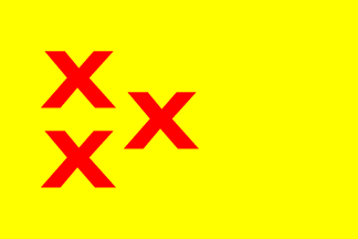
I'm surprised that the flag shows, instead
of heraldic saltires coupee, typographic "x" letterforms. Is this
accurate or an erroneous variant?
António Martins-Tuválkin, 11 July 2016
TTBOMK, these are the saltires of the Lords of Strijen. In The
Netherlands, saltires are most often couped perpendicular, different
from the British Isles where horizontal couping seems more prominent
(which gives that letter X impression). For example, check the saltires
on the flag of Amsterdam.
The arms of the Lords of Strijen are the origin for the flag of Kamerik
as well, which
show the normal, Dutch, couped saltires. Curiously, after the merger of
Kamerik into Woerden, the Woerden flag includes a British style saltire
(top of same page).
The arms are shown in [sie62a] as one would expect them for Dutch arms.
The only possible flag of Strijen photograph I've seen is
here,
which hints that the ends are not couped horizontally.
But it's really not enough to be certain.
Peter Hans van den Muijzenberg, 17 Jul 2016
sy.gif) International Civic Arms : http://www.ngw.nl/
International Civic Arms : http://www.ngw.nl/
The Coat of Arms consists of a golden shield charged with three saltires gules
(red). The shield is covered with a count's crown and has two lions as
supporters. This Coat of Arms was already known in the Middle Ages.