
Last modified: 2021-05-22 by  klaus-michael schneider
Keywords: education |
Links: FOTW homepage |
search |
disclaimer and copyright |
write us |
mirrors
![[Flag of Colombia]](../images/c/co.gif) (2:3)
(2:3)  image by Željko Heimer, 20 May 2001
See Also:
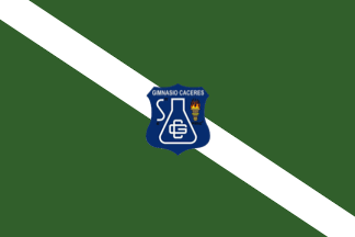 image by Ivan Sache, 1 January 2021
Gimnasio Cáceres, established in Bosa (Bogotá) by Alexander Cáceres, was
approved by Resolution No. 7,453 issued on 15 November 1998.
The flag of
Gimnasio Cáceres is green with a white diagonal stripe running from upper hoist
to lower fly, superimposed with the school's emblem.
Photos
https://gimnasiocaceres.edu.co/wp-content/uploads/2018/11/historia.jpg
https://gimnasiocaceres.edu.co/2019/02
http://gimnasiocaceresdc.blogspot.com/2012/12/simbolos.html
Green
represents hope and functionality. The white diagonal stripe represents peace,
knowledge and purity.
The emblem features an Erlenmeyer (titration)
flask, representing science as a tool used in chemistry, inscribed with the
school's initials; a torch representing fire as the source of light; and an
integral sign (∫).
https://gimnasiocaceres.edu.co/acerca-de-nosotros
School website
Ivan Sache, 1 January 2021
 image by Ivan Sache, 16 January 2019
The flag of Instituto Agrícola de Cáchira (Department of Norte de Santander)
is horizontally divided green-white. Green is a symbol of hope while white is a
symbol of peace.
Source: school website
Ivan Sache, 16 January 2019
 image by Ivan Sache,
Institución Educativa Cadena Las Playas was established in Apartadó
(Antioquia) in 2002 as Institución Educativa Urbana Cadena Las Playas,
the merger of Colegio Cadena Las Playas and Escuela Rural Campoalegre,
which had been established on 22 January 1970. The name of the school
was shortened to Institución Educativa Cadena Las Playas by Resolution
No. 116 issued on 25 February 2013.
The flag of Institución Educativa Cadena Las Playas is described in
Chapter 1.5.1 of the Manual de Convivencia as horizontally divided
red-white.
Red represents the force used to build the institution.
White represents time dedicated to the community and all work dedicated
to the institution.
Source: manual de convivencia
Ivan Sache, 13 May 2021
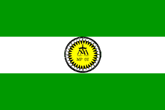 image by Ivan Sache, 7 January 2009
"Colegio Calasanz Bogotá" (CCB), founded on 21
March 1949 in Bogotá, was the first Piarist foundation in
Colombia. The order was founded in the 17th century by St. Joseph
Calasanz (1557-1648), who was declared "Universal Patron of
all the Christian popular schools in the world" by Pope Pius
XII in 1948. Calasanz founded in 1597 the first free school in
Europe, and, in 1617 the "Pauline Congregation of Poor
Cleric Regulars of the Mother of God of the Pious Schools"
(named after Pope Paul V, who had approved it), which was
elevated to a religious order in 1621 by Pope Gregory XV. The
Piarists are known as "Escolapios" in some parts of South America,
including Colombia. See: escolapios.org.co.
The flag of CCB, according to a photo and the description
available on the CCB
website, is horizontally divided green-white-green with the
Piarist emblem in the middle.
Green represents the earth and our worldly history. White
represents the celeste light and eternal life. The combination of
the two colours represents the Piarist educationalist ideal, to
reach God through the human life considered with radicality. The
flag represents, therefore, the two Piarist educationalist
principles, piety and literature, or, God's light
and the human science's light.
The Piarist emblem is made of a yellow sun with the anagram of
the name of the Blessed Virgin in the middle and four Greek
letters (mu, pi, thęta, gamma) standing for "Maria, Mother
of God". The emblem means that the Blessed Virgin is the
shield and protection of the students, whose way is enlightened
by Jesus, light of the world.
Ivan Sache, 7 January 2009
 image by Ivan Sache, 13 July 2014
The flag appears to be used, at least in non institutional events, without
the institute's emblem in the middle.
Photo:
http://www.ccb.edu.co/images/phocagallery/JMJ_Rio_2013/thumbs/phoca_thumb_l_dsc09990.jpg
- World Youth Day 2013, Rio de Janeiro
Ivan Sache, 13 July 2014
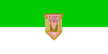 image by Ivan Sache, 04 July 2011
"Escuela Normal Superior de Caldas" was founded on 26 January 2010 by
Departmental Decree No. 86 in Manizales (Caldas Department),
as "Escuela Normal Nacional de Señoritas".
The flag of the institute, as shown and described on the institute's blog, is
horizontally divided green-white. In the middle of the flag is placed the emblem
of the institute. Green represent high aspirations and the ideal of Jesus. White
represents a fair and pacific society and the purity of the heart.
The emblem is based on the coat of arms of Manizales.
The pink triangle symbolizes the commitment to education required from the
teachers; the triangle is charged with the letters "ENSC". The three capitals of
Greek style, on a golden (ochre yellow) background support the teaching
activity. The coffee branches represent the region's economy and culture. The
wheat seeds, as said in the anthem, are seeds of goodness and love. The triangle
in the base of the shield is charged with a book showing artistic symbols,
expressing the emphasis of the institute.
Source:
http://www.normalsuperiordecaldas.edu.co/identifica/simbolos.html
Ivan Sache, 04 July 2011
 image by Ivan Sache, 01 November 2011
Instituto Tecnológico Superior de Caldas (ITEC) is based in Manizales, Caldas
Department.
The flag of the institute, as used during the schools' parade held on 7 August
2000 in Manizales, is horizontally divided green-white.
Images:
-
Identification of ITEC
-
Flag
-
Flag
Ivan Sache, 01 November 2011
 image by Jairo Alonso Méndez Méndez, 14 November 2004
Instituto Universitario de Caldas (Manizales, Caldas).
Jairo Alonso Méndez Méndez, 14 November 2004
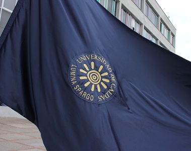
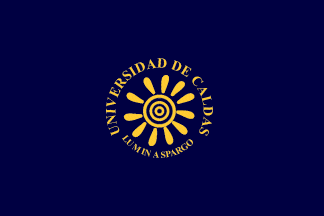 image by Randy Young, 13 November 2015
The University of Caldas, founded in Manizales on 24 May 1943,
is made of the Faculties of Agronomic Sciences, Law and Social
Sciences, Exact and Nature Sciences, Health Sciences,
Engineering, and Arts and Humanities.
The flag of the
university, as shown graphically and described on the university
website, is blue with the emblem of the university in the
middle.
The institutional colours are associated with thought, as the
quality and luminosity of gold and the deepness, seriousness and
solemnity of blue. The contrast and the location of the emblem in
the middle of the flag increases the meaning of the colours,
offering a both classical and stunning picture.
The emblem of the university is a sun with eleven rays,
surrounded by the name of the university and its motto,
"Lumina spargo" (also the name of the university
review), all in yellow.
Ivan Sache, 27 December 2008
Here's an
actual picture of the flag from the
University's
website.
Esteban Rivera, 08 November 2015
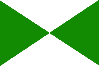 image by Ivan Sache, 1 January 2021
Gimnasio del Calima (GIDELCA) is located in Darién, Calima (Valle del Cauca).
GIDELCA was inaugurated on 4 October 1961 by the parish priest Luis Hernando
Ramírez. GIDELCA incorporated in 1963 Escuela Normal de Seńoritas, which had
been inaugurated on 18 September 1960, as part of Colegio Nuestra Seńora de la
Sabiduría established by nuns of the congregation of the Daughters of Wisdom.
https://sites.google.com/site/algebragrado113/institucion-educativa
GIDELCA unofficial website
The flag of GIDELCA is quartered per saltire
green-white.
Green is a symbol of hope, while white is a symbol of
environmental purity.
https://gidelcaenlinea.wordpress.com/rectoria
GIDELCA website
Ivan Sache, 1 January 2021
 image by Ivan Sache, 08 September 2014
Institución Educativa Técnica Camila Molano was established in Lorenzo Urueña
borough, part of the municipality of Venadillo (Tolima Department), by
Resolution No. 65 of 20 March 1963. Colegio de Bachillerato Comercial Camila
Molina was established by Decree No. 733 of 19 May 1987. Institución Educativa
Técnica Camila Molano was eventually established by Resolution No. 917 of 14
August 2002 as the merger of several smaller institutes. The institute is named
for Camila Molano, from Espinal (Tolima Department), appointed director of the
Venadillo girl's school in 1930.
The flag of the institute is horizontally divided aquamarine blue-white with a
gray triangle placed along the hoist. The flag was adopted in 1989, when the
institute was established, separating from Colegio Francisco Hurtado. White is
the colour of the sports uniform of the institute, and is a symbol of peace.
Aquamarine blue is the colour of the second uniform, adopted when the institute
was re-established in 1987. Gray is the colour of the first uniform used at the
institute.
Source:
http://camilamolano.freeservers.com/emblemas.htm - Institute's website
Photos:
http://4.bp.blogspot.com/_vnzkC9RKkOY/TJbrUItnT2I/AAAAAAAAABE/bikimkiyCLU/s1600/24894_386931553619_706748619_3783153_962539_n.jpg
http://3.bp.blogspot.com/_Qh0qdquX-Gg/SZdVU3e-87I/AAAAAAAAAG0/FXFIaP_wEfA/s1600-h/DSC06444.JPG
Ivan Sache, 08 September 2014
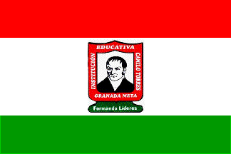 image by Ivan Sache, 13 July 2014
Institución Educativa Camilo Torres was established in November 1968 in
Granada (Meta Department) by Ordinance No. 21, as Colegio de Bachillerato para
varones. Ordinance No. 13 of 27 November 1970 renamed the institute Colegio
Departamental de Bachillerato Camilo Torres. Decree No. 425 of 25 June 2002
merged Colegio Departamental de Bachillerato Camilo Torres, Escuela Antonio
Ricaurte, Escuela Alonso Montoya Pava and Unidad Educativa Club de Leones to
form Institución Educativa Camilo Torres. The institute is named for the
politician Camilo Torres Tenorio (1766-1816), President of the United Provinces
of the New Granada (1815-1816), captured and executed by the Royalist troops.
The flag of the institute is horizontally divided red-white-green (1:2:1)
with the institute's emblem in the middle. The emblem of the institute features
Camilo Torres, based on a painting shown in the Colombian National Museum (http://commons.wikimedia.org/wiki/File:Camilotorres.jpg).
A similar portrait is used on the 50 peso banknote released in 1986 by the Bank
of Colombia (http://yaymicro.com/stock-image/camilo-torres-tenorio/3503547).
The institute's motto reads "We educate leaders".
Source: institute website
Ivan Sache, 13 July 2014
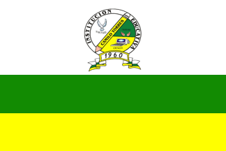 image by Ivan Sache, 13 May 2021
Institución Educativa Camilo Torres was established in 1960 in San Pedro de Urabá (Antioquia) as Escuela Camilo Torres, on a plot offered by priest Heriberto Zapata and a group of merchants, farmers and colonists. Colegio Camilo Torres was established by Resolution No. 9,547 issued on 3 November 1999. IE Camilo Torres was established by Resolution No. 1,621 issued on 26 February 2003 as the merger of Colegio Camilo Torres, Escuela Urbana Hernández Castillo and Escuela Urbana Zoila López. The school is named for the politician Camilo Torres Tenorio (1766-1816), President of the United Provinces of the New Granada (1815-1816), captured and executed by the Royalist troops. The symbols of IE Camilo Torres are described in Article 5 of the Manual de Convivencia.
The school's colors are related with its motto, "Virtud Ciencia Trabajo", prescribed in Article 4.
Virtue: White
Science: Yellow
Work: Green
5.1. Flag:
The flag was designed in 2003 by 9th grade student Nestor Fabin Vargas
Blanco during a contest open the entire educative community.
White means the education to values for a safe social cohesion, based on
God as everyone's fundamental axis. It is considered that anyone with a
good education to values is always in search of transcendence. The white
stripe covers one half of the flag. In its center is placed the
institution's coat of arms.
Green symbolizes dedication to work, as a base for everyone's
dignification, hope and aspiration to transcendence, and search of
change for personal and social achievement. The green stripe covers one
fourth of the flag.
Yellow represents science, research, technology and ability to transform
things, the production of knowledge to the personal, familial and social
service. The yellow color covers one fourth of the flag.
5.2. Coat of Arms:
The coat of arms has a circular shape, divided in the central part by a
pencil, the initial working tool of all students. It features the colors
of the flag, white, green and yellow.
White covers the central part, half of the circle, and represents
everyone's value; in the center of the white field is placed the symbol
of peace, a white dove taking off toward transcendence.
Green covers one fourth of the circle; charged with two open hands that
mean work as a proper tool allowing everyone's achievement.
Yellow covers one fourth of the circle, charged with a computer as a
symbol of advance of science and technology.
The circle's border is inscribed in capital letters the name of the
institute, completed on the pencil located in the center of the circle
and separating the white field from the other ones.
In the lower part of the coat of arms, a white scroll is inscribed with
the year of foundation of the first school at the origin of Institución
Camilo Torres, "1960"/ Its two ends feature the flag's colors.
Sources: institute history page Manual de Convivencia (2014)
Ivan Sache, 13 July 2014
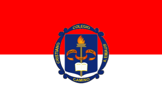 image by Ivan Sache,
1 January 2021
image by Ivan Sache,
1 January 2021
Colegio Cristiano Camino a Emaús was established in 1987 in Girón (Santander)
by Maríía Isolina Hernández Rodríguez, as Liceo Bolivariano.
The school was
acquired in 1995 by María Edi Sanabria de Suárez, who changed its political and
philosophical orientations and relocated it to Bucaramanga. Accordingly, the
school was renamed to Colegio Cristiano Camino a Emaús by Departmental
Resolution No. 288 issued on 11 February 1997.
The school's name, Road to
Emmaus, refers to the incident reported in the Gospels of Luke (24:13-35) and
Mark (16:12-13).
Source: School website
The flag of Colegio Cristiano Camino a Emaús is horizontally divided red-white with the
school's emblem in the center.
Red is a symbol of perseverance and tenacity required to attain the proposed objectives.
White represents the student's purity and integrity.
Source: School website
The coat of arms is composed of a blue shield surrounded by four
blue scrolls inscribed with the school's name in golden yellow letters.
The shield features a burning torch superimposed with a red scroll inscribed with
the institution's ideals, "Science, Light and Peace", and with an open Bible,
reflecting spiritual and intellectual knowledge in the search for personal
excellence.
Source: School website
Ivan Sache, 1 January 2021
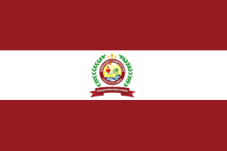 image by Ivan Sache, 1 January 2021
Gimnasio Campestre is located in Puerto Colombia (Atlantico).
The flag
of Gimnasio Campestre is horizontally divided red-white-red with the school's
emblem in the center.
https://www.facebook.com/gimcampestrePto
School's Facebook account
Ivan Sache, 1 January 2021
 image by Jairo Alonso Méndez Méndez, 23 September 2006
The Liceo Moderno Campestre is a High School located in Anapoima (Cundinamarca, Colombia),
non-official, created in 2005 by John Alexander Bejarano López,
professional from this city. The flag is builded with three
colors: green, white and blue. The description are written in
Spanish and taken by the newspaper "Moderníssimo",
published by this institute in this month, and printed by
"Ecos del Tequendama", other newspaper in the
Tequendama Province:
"Consta de tres superficies horizontales, el primer color
que la compone es el color verde: Símbolo de esperanza, fe y
naturaleza, es el reflejo de nuestros deseos y compromisos ante
la comunidad. Además, representa nuevos contextos de
aprendizaje.
El color blanco, símbolo de paz y pureza, unidad y bondad,
insignia de fraternidad para la Familia Modernista en el diario
vivir, parte esencial en su fortalecimiento como plantel
educativo.
El azul, color que representa tranquilidad y armonía, simboliza
para nosotros sabiduría y conocimiento, que se adquieren a
través de los procesos educativos llevados a cabo por toda la
comunidad educativa".
Jairo Alonso Méndez Méndez, 23 September 2006
 image by Ivan Sache,
5 July 2014
image by Ivan Sache,
5 July 2014
Colegio Campestre El Himalaya was established in 1993 in the Manila borough,
part of the municipality of Fusagasuga (Cundinamarca
Department).
The flag of the institute is horizontally divided
green-blue.
http://www.colegiocampestreelhimalaya.com/bandera-y-escudo.html
Ivan
Sache, 5 July 2014
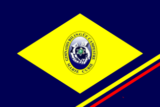 image by Ivan Sache, 3 January 2021
Gimnasio Bilingüe Campestre Marie Curie (GBCMC) is located in San Francisco
(Cundinamarca).
The name of GBCMC is a tribute to Marie Curie (1867-1934)
to the most important woman scientist of the 20th century, who dedicated her
life to research, always for the benefit of humanity.
She was the first woman
graduated from the Sorbonne University*, the first scientist woman (and still
the only one) to be awarded two Nobel Prizes [Physics, 1903, shared with Henri
Becquerel and Pierre Curie; Chemistry, 1911] ; her family is the only one to
have been awarded three Nobel Prizes [her daughter, Irčne Joliot-Curie, was
awarded the Nobel Prize in Chemistry, 1935, shared with her husband, Pierre
Joliot-Curie].
*This is wrong. Marie Curie was indeed the first woman
appointed professor at the Sorbonne, succeeding her husband Pierre, who had been
accidentally killed by a horse-drawn car. Her inaugural lecture on 5 November
1906 was widely commented in the media of the time.
The flag of Gimnasio
Campestre Marie Curie is blue with a yellow lozenge charged in the center with
the school's emblem.
Blue and yellow are the institutional colors,
related to intelligence.
Blue predominates in the planet's seas and skies,
inviting to the deepness of thought to reach utopias and great ideals.
Yellow
transmits energy, vitality, glee, enthusiasm, creativity, aspiration to quality
achievements and to produced really valuable results, like the productions of
our future researchers and artists?
The coat of arms features open hands,
symbolizing social open-mindedness and free and reflexive thinking
characterizing the educational community; the hand also guide the development of
the thought of the students and trigger their aspiration to knowledge. The atom
represents knowledge, not only in the field of life sciences, but also in social
sciences and arts.
https://www.gimnasiomariecurie.edu.co/nuestra-identidad
School website
Photo
https://www.elespectador.com/noticias/bogota/estudiantes-de-bogota-ganan-premio-en-concurso-de-robotica-en-estados-unidos
Ivan Sache, 3 January 2021
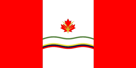 image by Ivan Sache, 10 January 2021
Colegio Canadiense is located in La Estrella (Antioquia).
The flag of
Colegio Canadiense, designed by student Santiago Bouhot Pantoja, is modeled on
the Canadian flag. The flag is charged in the center with the school's emblem
and three wavy yellow-blue-stripes representing Colombia.
The coat of
arms represents the union between Colombia and Canada, featuring their most
representative emblems, the red maple leaf for Canada and the yellow palm of wax
palm for Colombia. The red wavy stripe represents the mountains, plains and
territory of the two countries.
https://www.colegiocanadiense.edu.co/institucion/mision-vision-y-objetivos/46
School website
Ivan Sache, 10 January 2021
 image by Ivan Sache, 29 March 2009
"Gimnasio Cantillana" was founded in
February 1988 at Floridablanca, Department of Santander, by
ASPAEN ("Asociación para la Enseñenza), the organization
set up in Colombia by the Opus Dei movement
The flag of the institute, as shown graphically
and on a photo
on the website of the institute, is horizontally divided
blue-green-red.
Blue represents the immense sky and the unlimited horizon opened
by the education provided by the institute.
Green represents the high mountains surrounding the region, hope
and optimism.
Red represents the power and strength of the blood of Santander,
flooding for love.
Ivan Sache, 29 March 2009